A website is the face of any business and having a well-equipped web design is indeed essential for every business. Having a compelling website is not an option anymore. A poor website causes any business to lose potential customers and becomes a big loss for the business. Most often, small businesses tend to design their websites to save money, and control the website. But, little do they realize the good web design concept.
In short, web design is an art, the web design looks to give a unique experience to the visitors. It makes the visitor’s journey seamless, and to get this, web design has a few rules that web designers must follow. But, if the business tends to go in for web design, there is a high chance of web design mistakes that tends to lose potential customers.
Many websites have a few common mistakes that should be avoided. It is always a good decision to contact a web design company who is well aware of the common mistakes in web design. Also, a good best web design firms brings in a good search result.
If you are curious to know the various mistakes while designing a website, read the following points:

Too much content on the web page

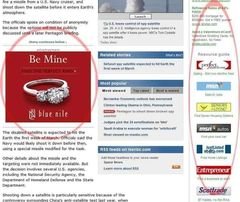
All you need is to present the applicable business information on your website in the right way. Visitors who enter your website should be able to get your business to gist in just a few seconds. If the landing page is dumped with a lot of information, it becomes confusing for the visitors, and they will have to spend a lot of time figuring out what it is all about. There is a high possibility that the visitors would exit the website. So, as a first point, see that you do not overcrowd your website with a lot of text, images, and other stuff that takes a lot of time to load. It is better to avoid heavy designs.
- Too less contenton the web page – As discussed in the previous point, avoid too much content, the other end of the spectrum is to avoid too little content on the web page. Simple and clean design is the current trend for web design when it is done correctly. Sometimes, a few business websites are over mysterious and leave too much for the visitors to the image. This is yet another web design mistake. When a visitor enters your website, they look out for relevant information about your business. Include that information that potential customers need to know on the landing page supported with minimal graphics.
An unpleasant Call to Action (CTA) –

Including a CTA is an essential feature of any business website as CTA becomes the gateway for any business. It generally informs the visitors to perform some action. For example, CTA could click here, login, contact us, etc., based on the business goals. So, your CTA must inform the visitors what they need to do. It should represent sufficient information for the visitors to act with it. Also, your CTA should be short and inform customers the right thing. Give the visitors a few minutes to read through and to decide before the CTA comes in.
Poor usage of whitespace and content

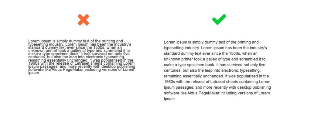
Content is an essential part of any website and marketing campaign. Content tells the visitors the gist of your products and services. So, ensure you present the content and its font pleasingly. The font style and color represent your brand image, so ensure that you select an attractive font. Make proper use of white space that gets the visitor’s eye around your website. Including a big text on the web is one of the common mistakes in web design. Chunk the text as far as possible and bring in more visual elements for concepts. Also, the content should always be updated.
- Irrelevant images – Images and graphics are essential web design elements. Images convey challenging concepts quickly without having to read the text. However, many businesses make use of irrelevant images strangely with low-quality. This is another web design mistake. So, avoid this and place only high-quality, relevant images to get the eye of the visitors.
- Poor navigation –Every visitor who enters your website has no clue of where and what to do. So, one common concern here is the navigability issues that kill your website’s popularity. In the current era, everything needs to be delivered in no time, and if it takes longer, people will exit from the site. So, having a hard navigation menu is a common mistake in web design. So, implement the navigation aspect of a website and it becomes easy to notice.
Neglecting the target audience –

For any business, target audience analysis is essential. This is yet another mistake that takes place in a website design. A website should not speak to the entire population. If you do so, then you will have a messy website. The main significance of web design is to spend hours to create customer profiles and find out the target audience who would possibly visit your website. Your website design should be in such a way that it will naturally attract a specific visitor type.
- Missing contact information –Yet another common mistake in web design is to miss out on the contact information. People connect with your website as; the website is the face of your business. That said, while people on your website might decide to purchase or make use of your service, may require additional information and would want to contact you immediately. So, it is, indeed, essential that you have the necessary contact information so that it becomes handy when the visitors decide that you are the right business for them. Keep your contact information in a place where people can find it quickly so that they do not get frustrated and leave the website when they don’t see it.
- Placing ads in the wrong places –
One more common mistake people make in a web design is to place ads in the wrong places. Advertising is, indeed, required, and it is seen as a necessary evil in the web era. However, placing many ads and flashy graphics will frustrate the visitors and might end losing the business with them. All you need is to analyze your ads correctly, if they annoy you, then it’s surely annoying your visitors as well, So make corrections accordingly. Also, take care of pop-ups and make them easy to close by appearing in a small size. During the web design process, you need to keep the brand image and target audience in mind at each stage. With this, you will have a beautiful website that speaks to a lot of your business.
- Slow loading pages –People who come to the internet work at lightning They keep viewing many tabs simultaneously. This means that you need to maintain your website at a good speed. Ensure that all the website pages are fast-loading. If the website speed is slow, you are sure to get a high bounce rate.
Conclusion
Web design is not rocket science; however, it does take a lot of research and time. Most businesses struggle to get a lot of traffic. Avoid the common mistakes to get many leads and conversions on your website.